What is CSS Grid Property ?


Grid:-
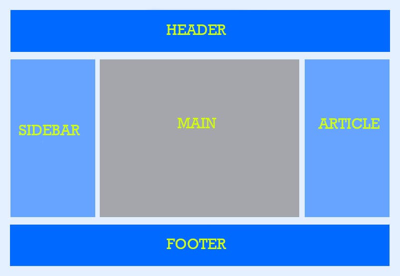
CSS Grid layout is a two-dimensional grid-based layout system. Flexbox was designed for layout in one dimension either a row or a column but grid was designed for two dimensional layout of rows and columns at the same time.
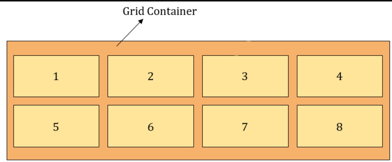
Grid Container:-
The element on which display:grid is applied. It is the direct parent of all grid items.
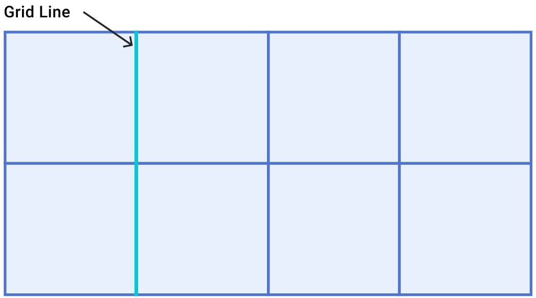
Grid Line:-
The dividing lines that make up the structure of the grid. They can be either vertical (columns grid lines) or horizontal (row grid lines) and reside on either side of a row or a column.
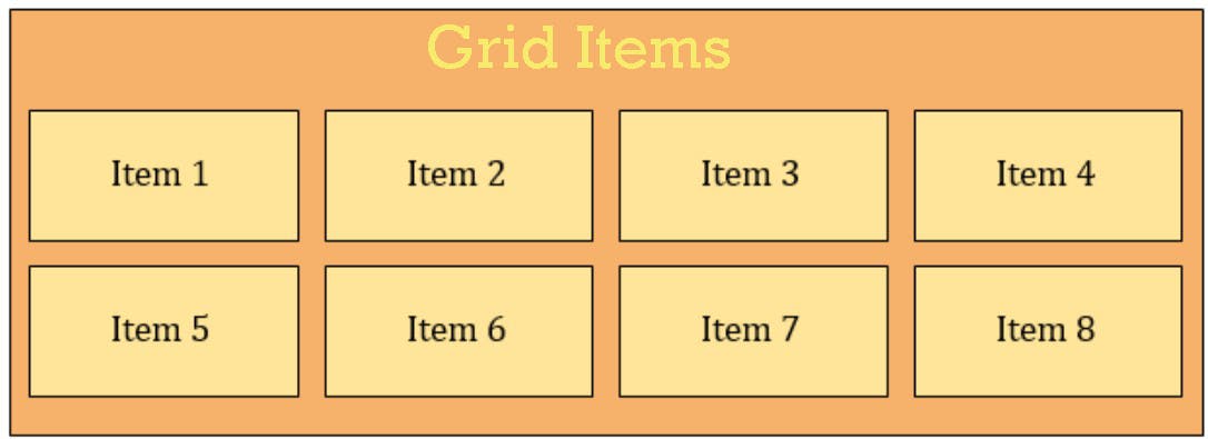
Grid Item:-
The children of the grid container are called grid items.
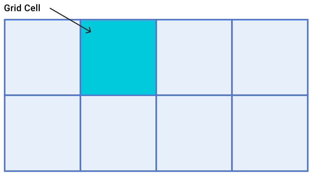
Grid Cell:-
The space between two adjacent rows and two adjacent columns grid lines. It is a single unit of the grid.
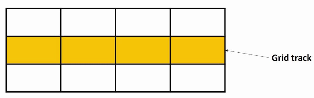
Grid Track:-
The space between two adjacent grid lines. We can think of them as the columns or rows of the grid.
Grid Area:-
The total space is surrounded by four grid lines. A grid area may be composed of any number of grid cells.
Properties for parent (grid container):-
Display:-
Defines the element as a grid container. Values:- 1. Grid- Generates a block-level grid (occupied all available space). 2. Inline-Grid- Generates an inline-level grid (occupied only required space).
Grid-template-columns:-
It defines the number of columns in a grid layout. Values:- Auto, px, fr
Grid-template-rows:-
It defines the number of rows in a grid layout. Values:- Auto, px, fr
Grid-template-areas:-
It defines areas within the grid layout. We can name grid items by using the grid-area property and then reference the name in the grid-template-areas property. Each area is defined by apostrophes ( ' ).
Column-gap:-
It defines the gap between columns in a grid.
row-gap:-
It defines the gap between rows in a grid.
gap:-
The gap property in a grid defines the size of the gap between the rows and columns in a grid layout.
Justify-items:-
Justify-items is used to align the grid items along the row axis. The value applies to all grid items inside the container. Values:- Start- Align items to the start edge of their cell. End- Align items to the end edge of their cell. Center- Align items in the center of their cell. Stretch- Fills the whole width of the cell. (this is the default value)
Align-items:-
Align-items are used to align the grid items along the column axis. The value applies to all grid items inside the container. Values:- Start- Align items to the start edge of their cell. End- Align items to the end edge of their cell. Center- Align items in the center of their cell. Stretch- Fills the whole height of the cell. (this is the default value) Baseline- Align items along the text baseline.
Place-items:-
Place-items sets both the align-items and justify-items properties in a single declaration.
Justify-content:-
This property aligns the grid along the row axis. By using this we can move the grid content in the horizontal direction. Values:- Start- Aligns the grid to the start edge of the grid container. End- Aligns the grid to the end edge of the grid container. Center- Aligns the grid in the center of the grid container. Stretch- Resizes the grid items to allow the grid to fill the full width of the grid container. Space-around- Places an even amount of space between each grid item with some spaces on the far ends. Space-between- Places an even amount of space between each grid item with no space at the far ends. Space-evenly- Places an even amount of space between each grid item including the far ends. (creates space at the far ends)
Align-content:-
This property aligns the grid along the column axis. By using this we can move the grid content in the vertical direction. Values:- Start- Aligns the grid to the start edge of the grid container. End- Aligns the grid to the end edge of the grid container. Center- Aligns the grid in the center of the grid container. Stretch- Resizes the grid items to allow the grid to fill the full width of the grid container. Space-around- Places an even amount of space between each grid item with some spaces on the far ends. Space-between- Places an even amount of space between each grid item with no space at the far ends. Space-evenly- Places an even amount of space between each grid item including the far ends. (creates space at the far ends)
Place-content:-
Place-content sets both the align-content and justify-content properties in a single declaration.
Properties for the children (grid items):-
Grid-column-start:-
It defines on which column line the item will start.
Grid-column-end:-
It defines how many columns an item will span or on which column line the item will end.
Grid-row-start:-
It defines on which row line the item will start.
Grid-row-end:-
It defines how many rows an item will span or on which row line the item will end.
Grid-column:-
It is shorthand for grid-column-start + grid-column-end.
Grid-row:-
It is shorthand for grid-row-start + grid-row-end.
grid-area:-
It is shorthand for grid-row-start + grid-column-start + grid-row-end + grid-column-end.
Justify-self:-
Aligns a grid item inside a cell along the row axis. This value applies to a grid item inside a single cell. Values:- Start, End, Center, Stretch
Align-self:-
Aligns a grid item inside a cell along the column axis. This value applies to the content inside a single grid item. Values:- Start, End, Center, Stretch
Place-self:-
Place-self sets both the align-self and justify-self properties in a single declaration.