What is Flexbox in CSS ?


Flexbox:-
Flexbox is a one-dimensional layout method for arranging items in rows or columns. Items flex (expand) to fill additional space or shrink to fit into smaller spaces. CSS Flexbox layout replaces Float layout.
Flex Container & Flex Item:-
A flex container is an HTML element whose display properties value is Flex or Inline-Flex. Flex items are the direct children of a flex container.
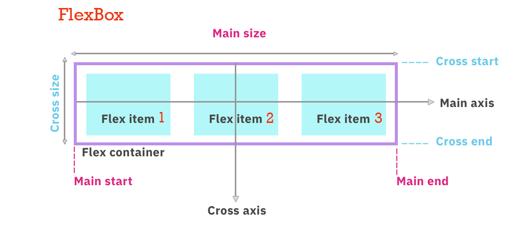
Main Axis:-
The main axis of a flex container is the primary axis along which flex items are laid out. It depends on the flex-direction property. The start and end of this axis are called the main start and main end.
Cross Axis:-
The axis perpendicular to the main axis is called the cross axis. Its direction depends on the main axis direction. The start and end of the axis are called the cross start and cross end.
Flexbox properties for the parent (flex container):-
Flex-direction:-
It defines the direction of the flex items, how they are placed in the flex container. Values:- row (default value), row-reverse, column, column-reverse
Flex-Wrap:-
It defines whether the flex items are forced in a single line or can be flowed into multiple lines. Values:- no wrap, wrap, wrap-reverse
Flex-flow:-
This is a shorthand for the flex-direction and flex-wrap properties. The default value is row-nowrap.
Justify-content:-
It is used to align the flex items horizontally. Values:- flex-start, flex-end, center, space-between, space-evenly, space-around
Align-items:-
It is used to vertically align the flex items. Values:- center, baseline, flex-start, flex-end, stretch
Gap:-
Controls the space between flex items. It applies the spacing only between items not on the outer edge. Values:- gap, row-gap, column-gap
Properties for the children (flex-items):-
Order:-
By default, flex items are laid out in the source order. The order property can be used to change the ordering.
Flex-grow:-
This defines the ability of a flex item to grow if necessary. It states what amount of available space inside the flex container the item should take up.
Flex-shrink:-
This defines the ability of a flex item to shrink if necessary. Negative values are invalid.
Flex-basis:-
It defines the initial size of the flex item. It only works on the flex items so if the container item is not a flex item, the flex-basis property will not affect the corresponding item.
Align-self:-
It defines the alignment in the block direction for the selected item inside a flexbox or grid container. The block direction is downward and the inline direction is left and right. Values:- auto, flex-start, center, baseline, stretch