What is Media Query ?


Media Query:-
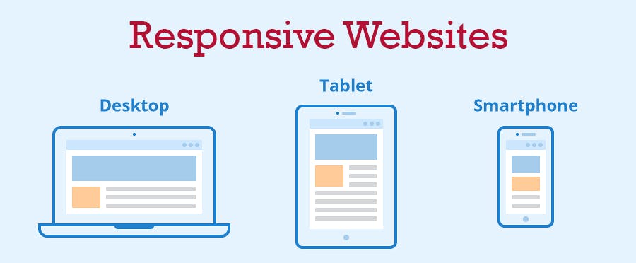
Media queries are a key part of responsive web design, as they allow us to create different layouts depending on the size of the viewport (screen size).
CSS Breakpoints:-
CSS breakpoints are used to adjust the styling of a webpage to match the screen width of the device it is being viewed on. The most common breakpoints are based on the width of the device screen, but other criteria such as screen resolution can also be used.
Viewport:-
The viewport is the user's visible area of a web page. The viewport varies with the device. Before tablets and mobile phones, web pages were designed only for computer screens and it was common for web pages to have a static design and a fixed size.
Breakpoints for different devices:-
Mobile devices:- 320px to 480px
Ipads and Tablets:- 481px to 768px
Small screens, Laptops:- 769px to 1024px
Desktops, Large screens:- 1025px to 1200px
Extra large screens, TV:- 1201px and More.